Gone are days of small screen mobile phones as large screen Phablet are streaming into the market and creating challenges for mobile UX design. As one can easily understand that trend of Phablet usage is going to last for a long time so it is high time for websites and other related media to adapt according to large screen scenario.
What is a Phablet?
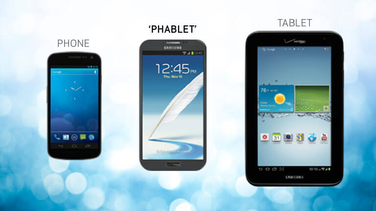
By definition Phablet is a combination of two words: Phone and tablet thus giving the word Phablet. It is convenient to understand that Phablet typically means a phone with a screen size matching to a normal tablet screen. Users are highly getting addicted to ultra HD picture quality and large screen of these mobile devices. This must be a high consideration for all those involved in development of products related to smartphone industry like apps developers, multimedia creators, web designers and web developers.
Future of Phablet
Several research studies depict that enormous amount of visual content is being consumed through these portable gadgets and this is even surpassing main feature of a phone, making calls. Another important point to ponder regarding future of Mobile UX is gigantic rise in demand for these Phablets. Growth in usage of Phablet will grow at an average rate of 36% in next 3 years whereas smartphone market on whole will grow at 4% only.
Impact on Mobile UX
Mobile UX design is all about providing a flawless experience to user without being hitched with unnecessary elements of design. Innovation in design is an utmost requirement to deal with higher stakes of enlarged display screens of Phablet.
Recent times have shown that launch of a shiny new Phablet is not only fascinating for common user but it also creates huge ripples in community of developers and designers involved in development Mobile UX for various related technologies. It alters perceptions about design work, it requires modifications in method of interactions and it creates tsunami in Mobile design trends in a matter of weeks. It requires forgetting whatever was learnt at launch of previous device and get started to work from scratch to adapt to new standards of Mobile UX.
Is Responsive Design enough?
Some might argue that Responsive design can handle all mobile UX challenges but in a world of 4K and beyond, responsive design can hardly be of complete assistance. An orphan feature like responsive design can hardly be of any use without being standardized like HTML beast was tamed by W3C. Although a near-to-appropriate result can be achieved by responsive design but customized changes are required for different categories of screen resolutions.
An annoyed designer can even complain that issues related to Mobile UX can be minimized if dedicated layout for each new Phablet was arranged by designers and developers. But unfortunately product development arms of companies like Apple and Samsung don’t agree with them.
Way Forward
It seems that as each Phablet making company is catering demand of higher screen size and resolution, it is time that designers and developers also respect this demand of a common user and start utilizing extra space to display more content and arrange advanced navigation for Mobile UX of every new Phablet, if not for all than for major launches of each year.
It will create a healthy competition with Phablet manufactures and like every such struggle, end user will receive best possible product. Phablet are hot favorites among mobile users all around the globe and huge swaths of them will be ditching their older smartphone with smaller screens for these larger sized Phablets. It is high time that designers and developers gear up for the future as those who don’t adapt become the dust of past.
We Design everything with passing and in-depth analysis of your market, customers, opportunities and competition to push the web to its full business potential, delivering you maximum ROI.


Our Work