CMS design is something that must be taken care of by designers and developers. Lot depends on the business category for which a CMS design is being worked upon, but there still remains some generic rules that must be followed to achieve a CMS design that is innovative and catchy at the same.
Flawless user interface
The user interface of your CMS design should be devoid of everything that is not necessary in terms of users completing their tasks. Most CMS products will have capabilities in excess of what is being used, but don’t show it if they don’t use it. And many products will have optional extras and upgrade possibilities, so your version might not have all the bells and whistles. For better or worse, some vendors will leave a stub to these missing features possibly to help encourage up-sell. Don’t show it if they can’t use it.
Use CSS to hide stuff if you have to, but clean up that interface. It especially applies to main navigation, links, and irrelevant details spat out by the system. This also applies to words. Each page title, sub heading, button label, navigation label, form field label, icon and graphic should be useful and meaningful, clearly communicating what it should.
Don’t forget to be responsive
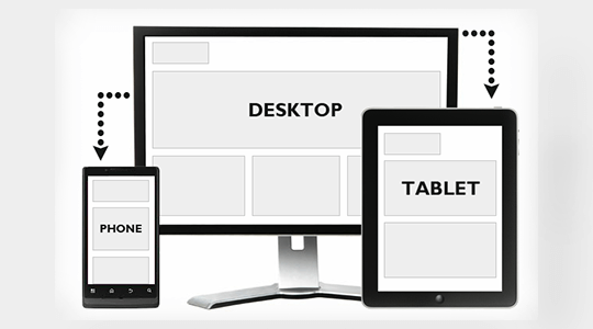
If your website should work well with phones and mobile devices, then it must be designed accordingly. Layouts that rely strongly on columns and grids can have problems, because side-by-side presentation does not work well on tiny screens. In order to be adaptable to mobile devices, layouts must easily “re-flow” to smaller numbers of columns and ultimately to just a single column without changing the HTML itself.
Home Page must be marvelous
Home for your CMS design should be, without any doubt, amazing and catchy. A home page or start page or dashboard for the CMS is a great idea if well crafted, containing useful items. Don’t load it up with out-of-the-box clutter (typically “workflow” related items) find out what your users need to know when they first login. Use this page to give easy access to key tasks, by prioritising all the things that the system can do, and giving prominence to the core tasks users need to perform (displayed bigger, higher on the page and perhaps with icons). Infrequently used or less important items can be smaller and further down the page, if they’re shown at all.
Keep it Unique
For all the popular Content Management Systems, it’s possible for your developer to create a custom template, tailored to the needs of your business. Every business has an image, and the best way for you to get that image across is to use a truly original, built from scratch template. This will ensure that your site is unique and functions exactly the way you need it to.
Navigation must be easy
Your navigation and menus should be designed to grow. Website owners can add or remove pages and even whole sections on a whim. Menus should be designed to grow or shrink automatically when this happens.
Consistency is crucial in CMS design
The user interface should be consistent across screens, pages and components. This includes navigation, buttons, form controls, text styling, link styling, form layout, terminology and feedback mechanisms i.e. alert boxes or ‘yellow fade’.
This is especially the case if certain parts have been customized, which normally stand out as being substantially different in look and feel. Delivering a “Frankenstein” is a sure fire way of making the system look like a hodge podge which won’t help user’s perception or acceptance of a new system. They must feel it’s a quality product.
We Design everything with passing and in-depth analysis of your market, customers, opportunities and competition to push the web to its full business potential, delivering you maximum ROI.


Our Work